GenTwo, a Swiss fintech founded in 2018, enables banks and asset managers to quickly turn any asset into a bankable product. Its platforms, GenTwo Pro and GenTwo Pro for Banks, support over 300 clients in creating digital and traditional asset products, totaling $5 billion. With recent expansion to the UK, GenTwo aims for a U.S. launch in 2025.
Context
The dashboard is designed for a financial technology platform, GenTwo, which offers tools for asset managers, banks, and financial intermediaries to create, manage, and monitor customized financial products. GenTwo enables these clients to turn various assets into bankable products with ease, emphasizing accessibility, flexibility, and real-time tracking.
Details
Role:
UX/UI Designer, Design Project Coordinator
Involvement:
(UX) Research,(UI) Visual, Prototyping, Testing
Overview
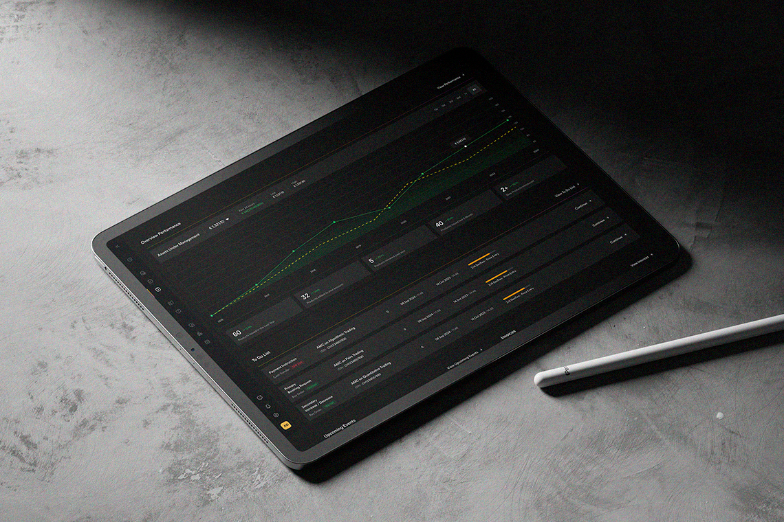
The dashboard presents a clean, organized interface that consolidates key performance indicators, task management, events, and educational resources in one place. It aims to streamline product management and decision-making for GenTwo’s users.
Challenge
Users in the financial industry require a dashboard that balances complex data visualization with intuitive usability. They need real-time information, accessible resources, and reminders for tasks and upcoming events to effectively manage and expand their financial products. Ensuring ease of use while presenting critical data without overwhelming the user is a significant design challenge.
- Discovery and Research
- User Research Preparation
- User Interviews and Research Sessions
- Synthesis of Insights
- Ideation and Concept Development
- Design Prototyping
- Iteration and Refinement
- Post-Launch User Research (Optional)
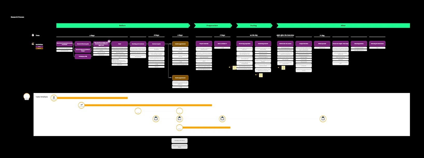
Research Process Summary
The research process is divided into several stages:
Before (Initial Steps):
- Preparation: Conduct secondary research, identify participants, and establish objectives.
- Scheduling & Outreach: Arrange interviews, send initial outreach emails, and coordinate times with participants.
Preparation (3 Days to 1 Day Before):
- Final Reminders & Preparation: Confirm appointments, prepare research materials, and send reminders to participants.
During (On the Interview Day):
- Interview Execution: Conduct interviews, gather insights, and ensure effective note-taking.
After (Post-Interview Follow-up):
- Immediate Actions: Send post-interview thank-you notes and analyze initial feedback.
- Data Processing: Compile insights, refine findings, and consolidate data for further action.
The process is guided by time-sensitive tasks and uses various tools to track milestones and document outcomes, ensuring organized and efficient data collection and analysis.
GenTwo Pro Dashboard: Foundations for 3.0
Project Background
With the aim of building a powerful and user-centric Dashboard 3.0, we started by refining the existing Dashboards 1.0 and 2.0, setting a solid foundation for further development.
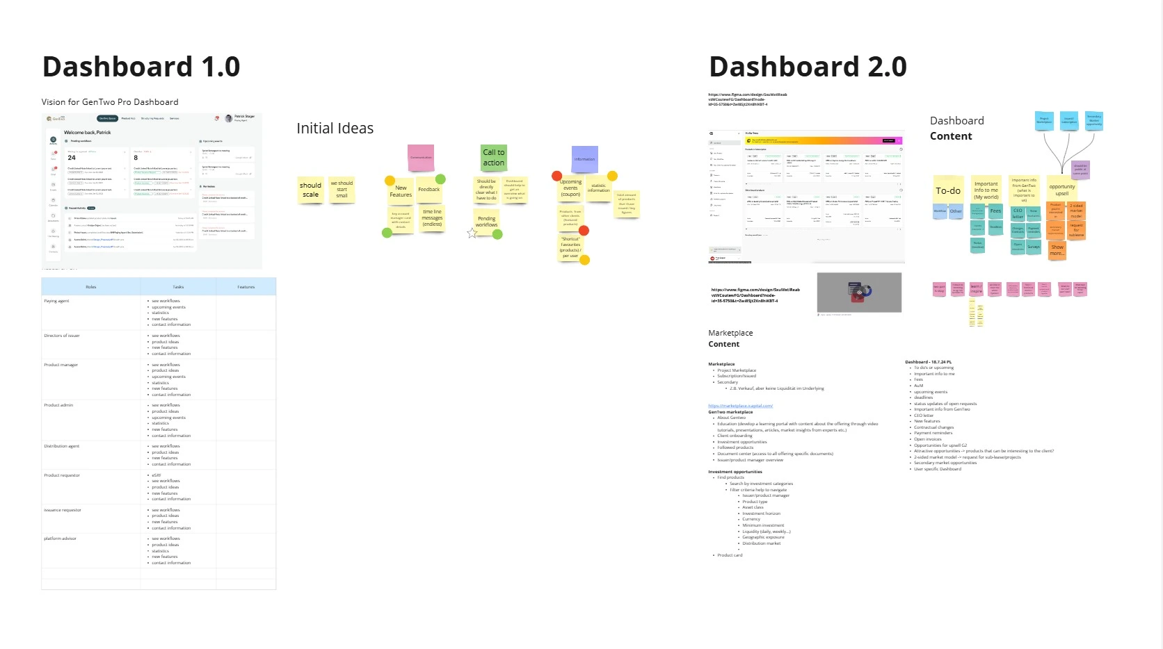
Dashboard 1.0: Starting Point
Objective
Dashboard 1.0 provided a basic structure to address role-specific needs. It included essential workflows, tasks, and a foundation for future growth.
Challenges
Users found it limiting for complex workflows, and it lacked customization options needed for different roles.
Dashboard 2.0: Refining the Experience
Improvements
Dashboard 2.0 was a major leap, introducing:
- Role-Based Personalization: Tailored content and tasks for each user role.
- Marketplace Access: Direct integration for easy navigation to investment and educational content.
- Streamlined Design: A scalable, clean layout to prioritize user tasks and insights.
Impact
The updates made in 2.0 laid the groundwork for the upcoming 3.0 version, providing a more flexible, user-focused experience.
Bridging Feedback & Vision: Create the First Concept
Before jumping into user interviews, we sketched out a first concept for the Gentwo dashboard—a starting point that combined what we’d learned from the past with fresh ideas from the leadership team.
1. Learning from What Worked (and What Didn’t)
We dug into feedback from earlier versions of the product, focusing on what users struggled with and what they valued most. This gave us a solid foundation to build on, making sure we didn’t repeat past mistakes while improving the things that mattered.
2. Aligning with Big-Picture Goals
We also worked closely with Business Analysts and C-Level leaders to understand their vision for the dashboard. They shared ideas on:
- How the dashboard could support the company’s growth.
- What features were must-haves for the business.
- How to strike the right balance between user needs and business goals.
This step ensured the design wasn’t just functional but aligned with the larger strategy.
3. Building the First Concept
Using these insights, we pulled together an initial draft of the dashboard. It included:
- Core features based on user feedback.
- Fresh, forward-thinking ideas inspired by leadership.
- A flexible structure that left room for iteration after speaking with users.
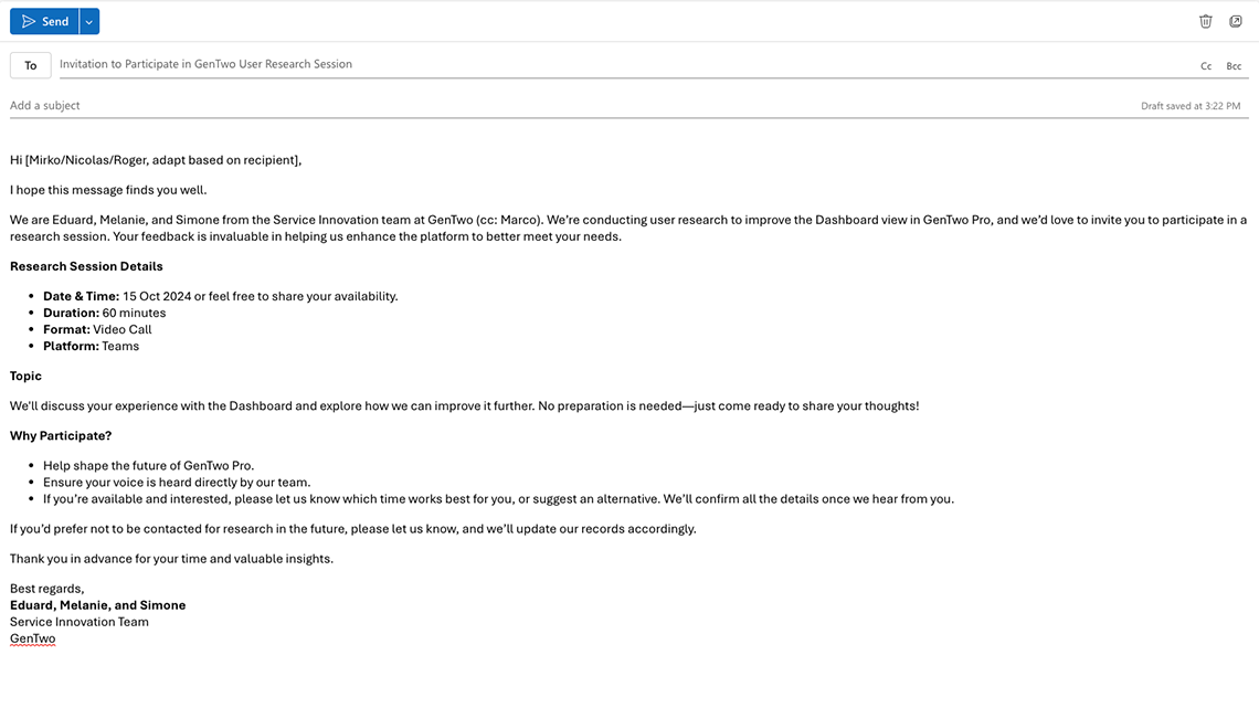
Invitation to Participate in a User Interview
To gain deeper insights into our users’ needs and behaviors, I conducted user interviews as part of my design process. These interviews aimed to understand pain points, motivations, and expectations to guide the development of a solution that genuinely resonates with our audience.
The invitation was crafted to be clear, concise, and inviting, ensuring participants felt valued and informed about their role. Here’s the text:
Listening, Learning, and Defining: Understanding Our Users
Designing the Gentwo dashboard started with one simple principle: listen to the people we’re building for. This phase was all about uncovering what users truly need and how we could help.
1. Talking to Users
We sat down with users to have honest conversations about their daily work and the challenges they face.
- We asked open-ended questions to really understand their pain points and goals.
- We listened carefully, taking notes on their thoughts, frustrations, and ideas.
- Every story and detail helped us paint a clearer picture of what matters to them.
These interviews weren’t just about gathering information—they were about building empathy and seeing the product through the users’ eyes.
2. Making Sense of It All
Once we had the stories, it was time to make sense of them. We sifted through our notes to find patterns, highlight common struggles, and uncover opportunities.
- We grouped similar feedback together to identify recurring themes.
- We defined clear user goals to guide our design decisions.
- Most importantly, we focused on what users cared about the most, ensuring their voices shaped the foundation of our work.
We prioritized two users who were actively engaged with the product.
To broaden our perspective, we connected with five users who were next in line to use the dashboard. While their input wasn’t based on hands-on experience yet, their fresh perspective was invaluable.
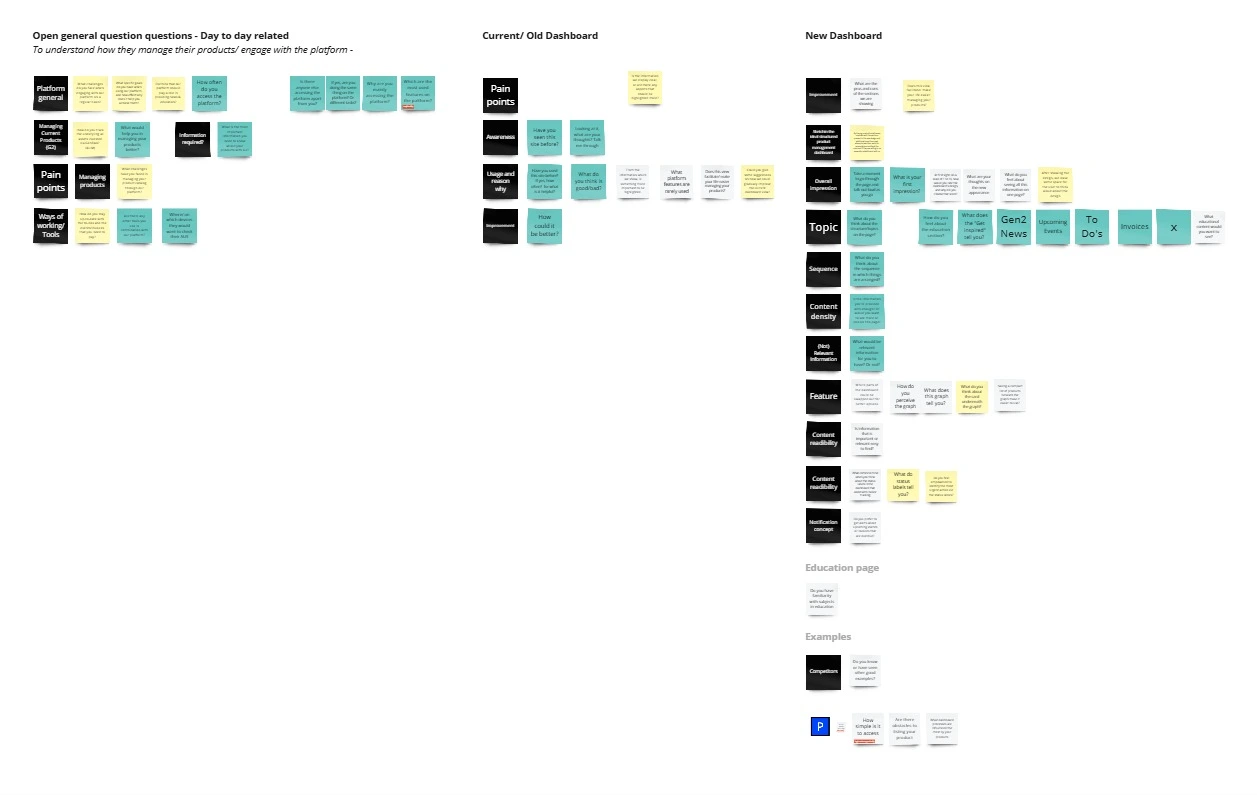
From Notes to Action: Organizing Insights for the Dashboard
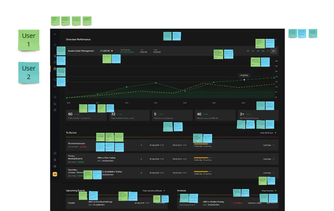
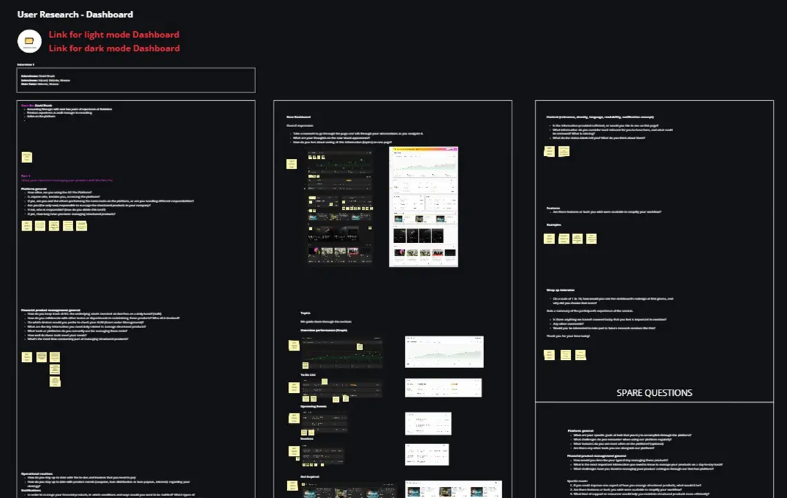
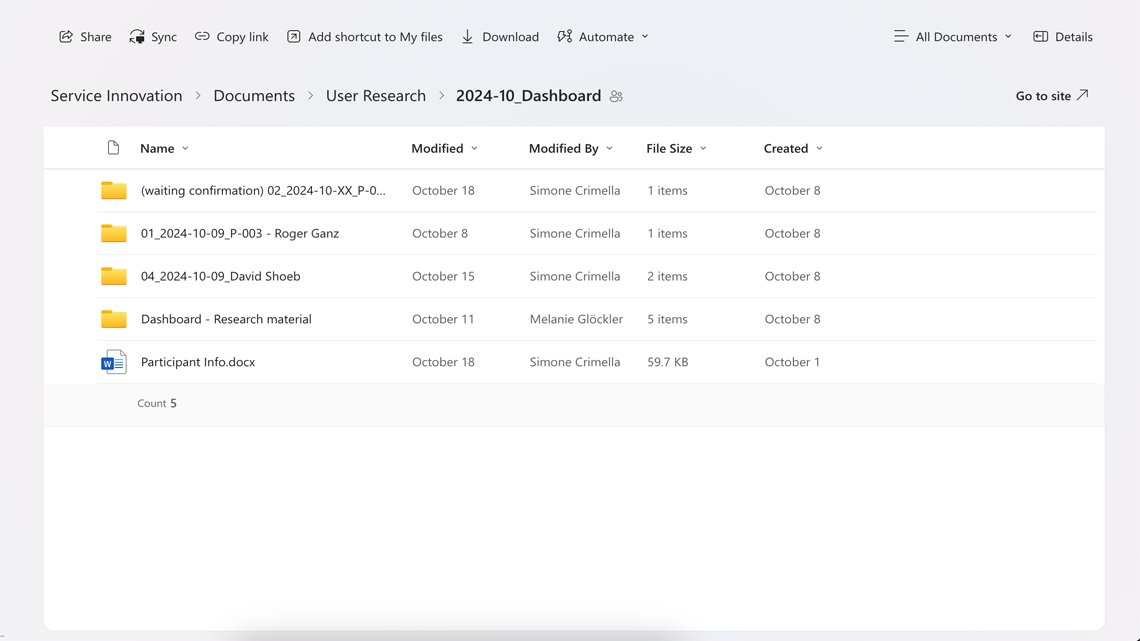
After wrapping up the video calls, I went through all the notes, added anything we missed, and made sure nothing was left out. To keep things clear and actionable, I sorted everything into two key sections in the dashboard, making it easy for the team to dive in and get started.
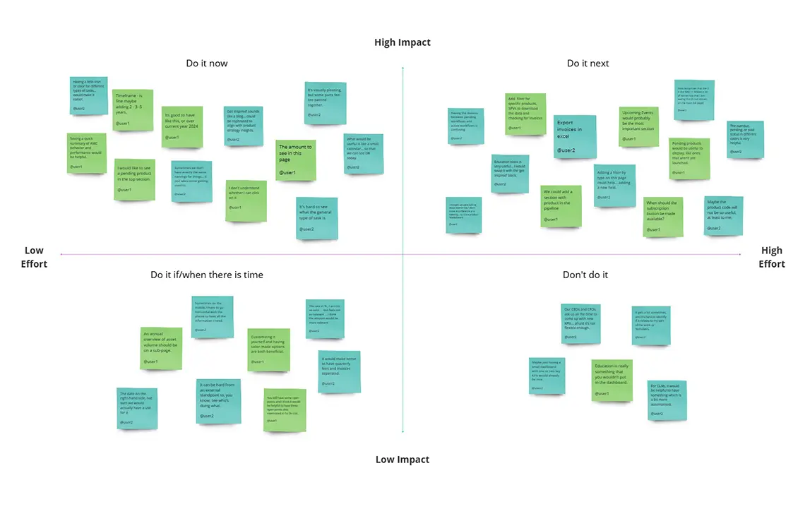
To make sure we’re working smart, not just hard, I put together an Effort Matrix. It helped us figure out what’s quick to tackle and what needs more time and focus, so we can balance our efforts and hit the most impactful goals first.
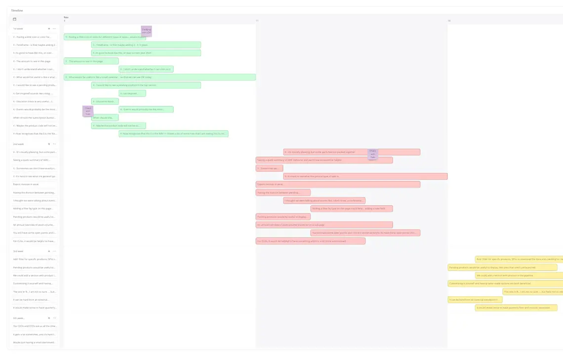
I also mapped out a Timeline to show how long each step might take, breaking it into clear milestones. It’s our guide to staying on track and making steady progress.
This process feels more organized and aligned, giving everyone a clear path forward while keeping the bigger picture in sight.
